The mandate
In 2022, while we were preparing to celebrate Prospek’s 20th anniversary, a wave of nostalgia overcame us. Prospek, a deeply human agency, was officially leaving its adolescence behind to enter adulthood. But what exactly does the end of adolescence entail?
A tumultuous time of life, adolescence gets its name from the latin adolescens, which means “growing.” After growing through 20 action-packed years, we felt we were at the top of our game, we knew who we were and what we had to offer: we were a big little agency whose activities were driven by strategy. But this identity was no longer reflected in our logo, which was created at a time when the agency was leaning more toward technology. It was like a reminder of an awkward high school rebellion phase, and we felt it was time to jettison the façade.
The solution
The general observation shared by the pair of experienced creators we tasked with the mandate was that the new logo had to be balanced, simple and modern. It had to represent the energy and dynamism of our agency while conveying the more mature side that comes from years of well-earned experience: in other words, distinct but complementary concepts to get across the agency’s versatility.
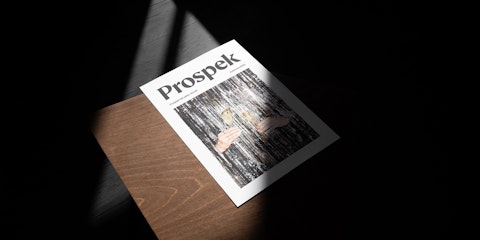
The result
This general idea came to life with very classic elements. We manually reworked the details of a beautiful seraph font to create a refined, one-of-a-kind logo while also integrating more black and white to better showcase our many productions. We also signaled change by adding yellow to the colour palette, a vibrant, energizing yellow that gave us a ray of light where we wanted it. After all, it’s what Prospek does: shine a light on marketing and communications challenges, then proceed to solve them.
In the same vein, we selected two complementary fonts: a serif font and a sans serif font, the latter which was the work of a Montreal studio. It’s very important for us to encourage local creators: because birds of a feather flock together!

"Rethinking the agency’s visual identity that we evolved to for over ten years was an extraordinary experience. But it was also very delicate as it was almost like doing a branding for yourself: every time you want to follow your intuition, you have to challenge it by digging a little deeper, getting to the bottom of things."
Charlotte Leblanc
Senior Art Director


It was over Christmas 2022, in a grand exclusive, that we unveiled to our precious clients and collaborators Prospek’s brave new identity brought to life in a logo, and today via the new website, we at last set out on our own!


